Ten amazing online timeline designs
You won't find any ugly PowerPoint timelines in this list. We have searched the web and can now present to you the ten most beautiful online timeline designs we could find.
Here at Tiki-Toki Timeline Maker headquarters, we absolutely love timelines. So much so we created our own service to allow people to make their own online timelines, and our users have created thousands of brilliant, informative timelines, many of which we have showcased in the 'Featured timeline' section of our blog.
But, as much as we love our own timeline maker service and users, we don't believe in being overly introspective. Other companies and individuals are doing amazing things in the timeline space, and they deserve some love too.
So for this blog post, rather than trumpeting our own achievements, we spent many hours searching the web for the best timeline designs we could find, and eventually settled on ten stunning timelines that we believe are the most amazing and inspirational on the web. Without further ado, let's take a look at the timelines.
Museum of the World
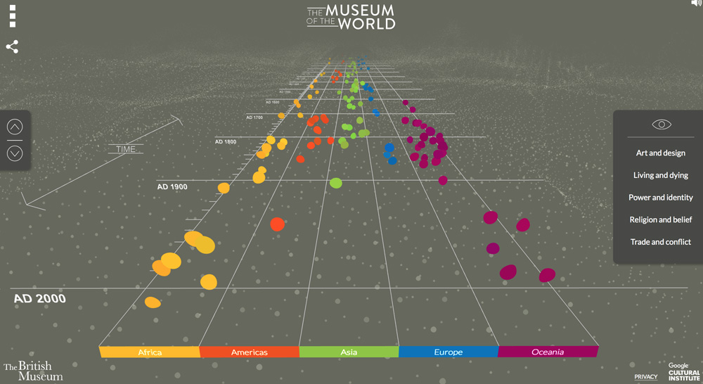
Have you ever wondered what would happen if one of the world's best museums teamed up with one of the world's leading tech companies to create a history project that pushed web technologies to their absolute limit. Well, wonder no more, because we have the answer in this spectacular 3d timeline.
A joint project by the British Museum and Google, the timeline uses WebGL technology to display important world events from a first person perspective, much like a 3d computer game.
Events are shown as little colored blobs - each color representing a different continent - that you can click on to reveal further information. In a neat effect, the timeline is surrounded either side by a landscape made out of tens of thousands of tiny dots that move and swirl as you navigate down the timeline.
The timeline should not be missed. Sadly, the full interactive timeline is no longer available. But you can view screenshots of it here and a video here.
Kings and Queens of England and Great Britain
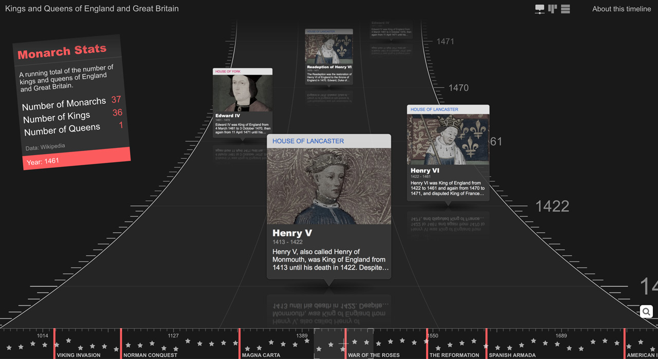
This timeline of the Kings and Queens of England and Great Britain takes a slightly different approach to the 3d timeline, with event panels falling down from the top of the screen in a curved trajectory. In some ways, the timeline outdoes the Museum of the World one, in that the event panels display images and text that can be accessed without having to click on them.
The timeline also has some other innovative features, such as the abilty to filter events by categories, a mini-navigation timeline that shows key events in English and British history, and an info box that updates statistics in real time as you scroll through the timeline.
Another neat touch are the reflections beneath the event panels. It all adds up to an amazing piece of interaction design that does a great job of showcasing the historical content. Well done to the creators, ChronoFlo Timeline Maker. You can view the timeline here.
Histography
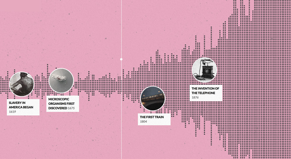
Designed by Tel Aviv-based graduate Matan Stauber, Histography uses Wikipedia data to display a complete timeline of all history, from the Big Bang to current events. But that description does not do Matan's creation justice. It is one of the most impressive works of interaction design we have seen, with amazing animations and interface design.
The timeline is made up of thousands of little dots, each representing a single event in history. When you hover over an event with your mouse, a circular panel pops up displaying an image or video of the event. You then click on the circle to display further information about the event in a larger panel.
Below the main timeline area is a slider that you can adjust to change the time range displayed on the timeline. This allows you to zoom in to view the finer detail of a period in time, or zoom out to get a wider perspective. There are also links you can click to jump to interesting points in time, such as the Renaissance or Stone Age.
In short, Histography is a wonderful resource for both history and interactive design buffs. If you haven't seen it before, you really ought to give Histography a try here.
Witcher Timeline
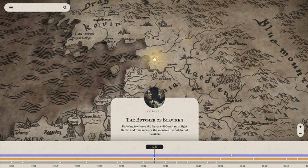
We're glad Netflix's Witcher TV series - based on the same novels by Polish writer Andrzej Sapkowskiwhich that inspired the award-winning Witcher games - had such a complex plot that many people couldn't follow it. Otherwise, Netflix wouldn't have commissioned this brilliant timeline.
Featuring stunning animations and interaction design, the timeline is made up of two sections, a date band at the bottom where you can view important events in the storyline and a map of the Witcher's fantasy world above. When you select an event, the map automatically scrolls to center on the location of the event.
While this timeline will be of most interest to fans of Geralt and his band of weird and wonderful acquaintances, it is also a must for anyone vaguely interested in interaction design. View the timeline here.
Middle East Protests Timeline
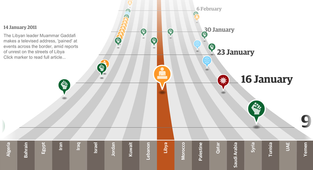
Nine years ago the big global news event was not a pandemic but protestors marching for democracy in the Middle East. It seemed that Arab countries were at last going to throw off the shackles of authoritarian dictatorships and embrace democracy. Alas, except in a few isolated cases, that ultimately did not happen. But the sense that something important was taking place can be witnessed in this great 3d timeline created for UK newspaper The Guardian.
If you can't view the timeline, please make sure that you enable the Flash plugin. Yes, yes, we know, Flash is an outdated technology nowadays. But this timeline is nine years old and at the time was a pioneering bit of web technology, being - we believe - the first example of a first-person 3d timeline on the web.
Learn how a Tunisian street vendor's self-immolation led to the biggest mass unrest the Arab world had seen for years by visiting the timeline here.
Bond Car Timeline
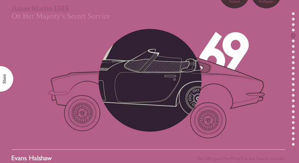
It is a little known fact that when he was not on international espionage missions on behalf of the British government, James Bond liked to knock out interactive websites to showcase the cars he had driven. Well, that is what he says. Personally, I think Q did all the coding for this amazing timeline while Bond was out drinking Vodka Martinis with his lady friends.
The real truth is actually even stranger. The Bond Car timeline was built by UK car dealership chain Evans Halshaw, presumably as a marketing ploy to raise the company's profile. Well, it certainly worked, as here I am writing about them. To their credit, the timeline is absolutely fantastic, as you can find out here.
Tower of London Timeline
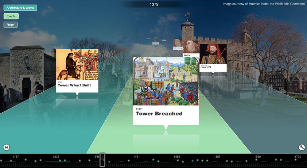
Okay, okay, we did say we were going to focus on timelines created by others. But we are very proud of Tiki-Toki Timeline Maker's ability to create 3d timelines and we thought you wouldn't mind too much if we included just one of our own.
This timeline of the Tower of London is typical of the 3d timelines you can create using Tiki-Toki. It features color-coded bands to align events of a particular category on the same line. It displays events with the image and title readily visible, so you don't need to hover or click on an event to find out what it is about, a problem most other 3d timelines suffer from.
And it boasts slick animations to fade out events and navigate through time. Plus, it is rocket-ship fast, thanks to its use of standard HTML5 technologies like canvas.
Have a play with the timeline here. If you enjoy the timeline, you might be interested to know that you can create a timeline just like it for free using Tiki-Toki Timeline Maker. Find out more here.
Gramercy Park Hotel Timeline
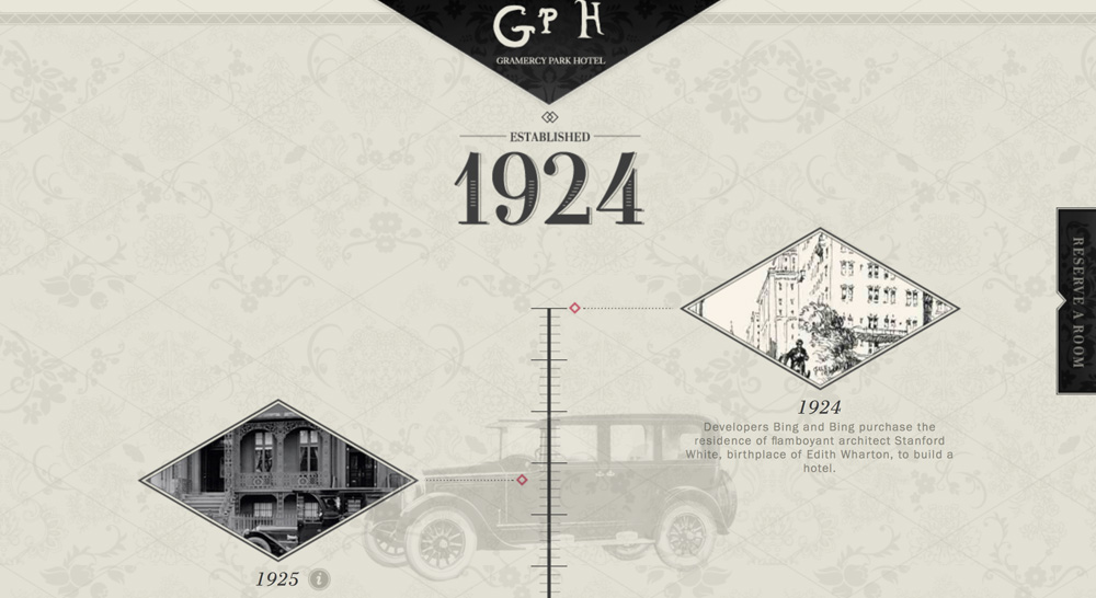
If there is one website that has wowed me more than any other in recent times, it is the website of the Gramercy Park Hotel in New York. Just like the hotel building itself - which was given a Renaissance-revival makeover in 2006 - the website* is an absolute treasure trove of beautiful design ideas.
You could easily spend an hour just exploring the website and admiring the user interface, interaction design and beautiful photographs. Eventually you would come to the hotel history section of the website, where key stories in the history of the hotel are told in the form of a vertical interactive timeline.
Just like the rest of the website, the timeline has a delightful design that perfectly matches the hotel. If you have the slightest interest in design, you will appreciate viewing the timeline.
*Sadly, the Gramercy Park Hotel and its website were closed down in 2020.
Bible History Timeline
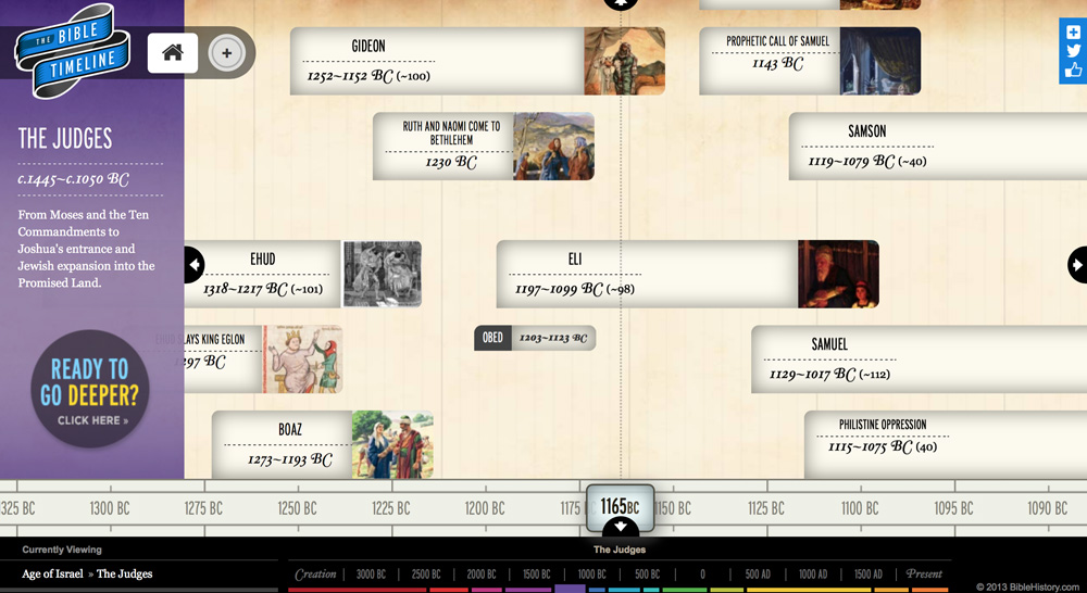
There are absolutely loads of biblical timelines out there. But this timeline - built by the team at BibleHistory.com - stands out from the crowd, thanks to its captivating design, beautiful images and use of a variety of colors to highlight different periods in biblical history.
The timeline also boasts a neat parallax scrolling effect whereby the background - designed to look at bit like a papyrus scroll - animates at a slower speed than the foreground layer where the events sit. Churches have often been at the forefront of web technologies and this timeline is a good example of this.
Like many of the other timelines in this list, it is worth viewing for the interaction design alone. If you are a fan of the subject matter, even better. View the timeline here.
Evolution of the Web Timeline
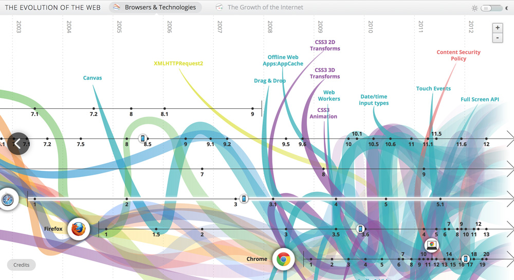
To me, this timeline is a bit like Einstein's theory of relativity. It is definitely deeply impressive but I would be lying if I said I completely understood it.
On first glance, the timeline looks like some kind of terrifying mutant sea creature, an explosion of multi-colored tentacles in search of their next victim. Look closer, though, and you begin to see that it is actually a chronological depiction of when new web technologies were adopted by the leading browser makers. At least, that's my conclusion.
Each tentacle represents a particular web technology such as HTML, Javascript or Flash. In a nice touch, when you hover over a technology tentacle, the rest get faded out and panels appear showing key developments that have taken place in that technology over time. You can view the timeline here.
Best of the Rest
We came across some other great timelines while researching for this article, and are including them here as they deserve some attention too. If you know of any other great timelines, drop us an email at hello@tiki-toki.com and we may include them in the list as well.
