Tiki-Toki News: Tags, spans and much more
20th Oct 2015 | Tasha G
It has been a long time since this blog was updated. This is not because we haven't had anything to report. Far from it, Tiki-Toki has undergone loads of improvements since we last posted. We just haven't had a chance to tell you all about them, because, well... I have been off for the past several months on maternity leave! And the rest of the team have been as busy as bees working on new features, providing customer support etc etc and simply haven't had the time to blog. Anyway, I am back now, so you can look forward to more regular posting.
Given the time since the last post, I thought it would be a good idea to mark my return by telling you about some of the things the Tiki-Toki team have achieved over the past several months. At the start of the year, we released a new version of our desktop app on the Chrome app store. This version allows Windows and Chromebook users to create timelines on their local computers. Mac users have had their own version of the desktop app since 2013. For those who are not aware, our desktop app is perfect for people who don't need a web-based timeline and want to keep all their timeline data safe and secure on their local computer. You can find out more about our desktop app here.
Launching the desktop app on a completely new platform was a major achievement for the team. But not the only one. More recently, the team undertook a redesign of the Tiki-Toki web admin interface, sprucing it up with a new translucent design and making improvements to how it works on iPads. Tiki-Toki's timelines have always been - and still are - beautiful but the old grey admin interface was increasingly showing its age. We hope you like the new design! We are planning to roll out this updated design to the Mac and Chrome desktop apps later this year.
As exciting as a new admin interface design is, we know it is not what gets our users' pulses racing. What our users love is new features. And we have a couple of belters for you. The first - launched a few months back - is tagging. Available to our premium account users, this allows users to tag stories with multiple keywords, and search stories with matching tags. Combined with our long-available category functionality, this provides much improved data definition and analysis for Tiki-Toki timelines.
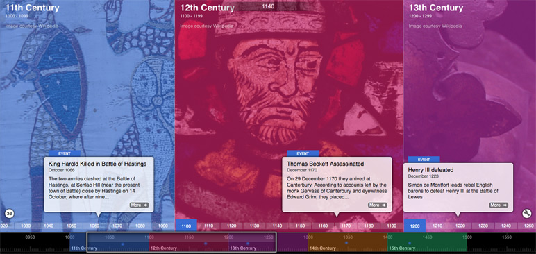
I am saving my favourite new feature for last. Just yesterday, Tiki-Toki launched a new 'span' feature which allows you to break your timeline up into blocks of time, each with their own colour and background image. Our team really pulled out all the stops with this feature. There are loads of ways you can customise the spans, choosing your own colour scheme, playing around with the opacity, selecting from three different span styles. I truly believe this feature will add a new dimension to your timelines, and I'd love to hear how people have been putting it to use.
So if you have created a brilliant timeline using our span feature, I'd love to hear from you and we may end up featuring it on our blog. As usual, if you have any questions, feedback of suggestions, please get in touch with us at blog@tiki-toki.com.
